![eniture_w89_h34.jpg]](https://support.eniture.com/hs-fs/hubfs/eniture_w89_h34.jpg?height=40&name=eniture_w89_h34.jpg)
Eniture Technology's Shopify app, DIY Tax Exempt Checkout, is written to provide a satisfactory viewing and user experience for most Shopify themes when rendered on a mobile device. If the width of the tax-exempt checkout widget is not rendering to your liking on a mobile device, follow these instructions to adjust it.
Step 1
Using the Shopify ADMIN menu, navigate to Online Store > Themes.
Step 2
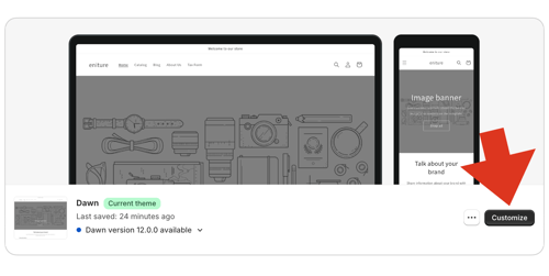
Click the Customize button for the theme you want to make adjustments to.
Step 3
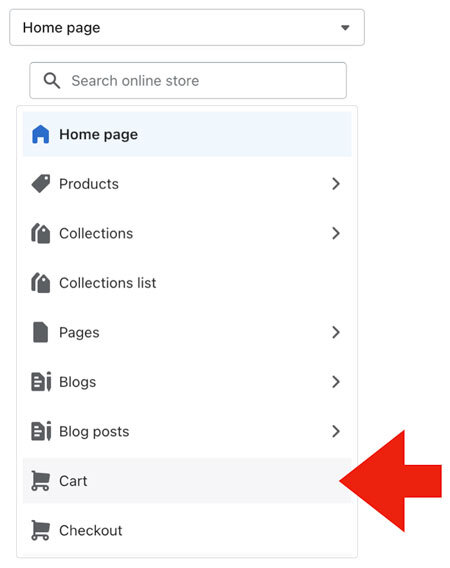
At the top of the page, select the Cart theme page from the dropdown menu.
Step 4
Select the option to view the appearance on a mobile device by selecting the icon for mobile devices in the top right corner of your browser window.
Step 5
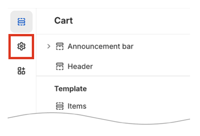
Click on the Settings icon in the left margin of the page.
Step 5
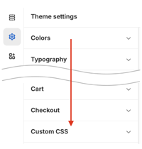
Click on the option for Custom CSS from the menu of theme settings.
Step 6
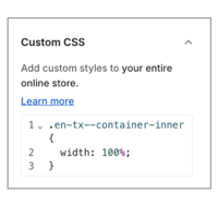
Copy and paste the following code into the input box for custom CSS code:
.en-tx--container-inner {width: 100%;}
Below is an illustration of the generally accepted formatted entry on a CSS style sheet. Edit your the code you pasted to match it.
To influence the display for different types of devices, like mobile, you can use the media queries such as the following:
Example 1:
@media only screen and (max-width: 300px) {
 .en-tx--container-inner {
width: 100% /*Adjust accordingly*/
   }
}
Example 2:
@media only screen and (max-width: 180px) {
   .en-tx--container-inner {
width: 100% /*Adjust accordingly*/
  }
}
Step 7
Adjust the width parameter from 100% to the value that results in the displayed width you prefer.
Step 8
Click the Save button in the top right corner of your browser window.